[Því miður er þessi grein aðeins birt á ensku]
With tourism growing at an acute rate, Icelandic agencies and landowners are now working to minimize accidents and preventable risks by building up the national travel infrastructure needed to support the large influx of incoming travellers. Hætta / Athugið contributes valuably to this effort with customizable icons and a thoughtful system that will soon be tested at popular tourist attractions in collaboration with the Environmental Agency of Iceland.
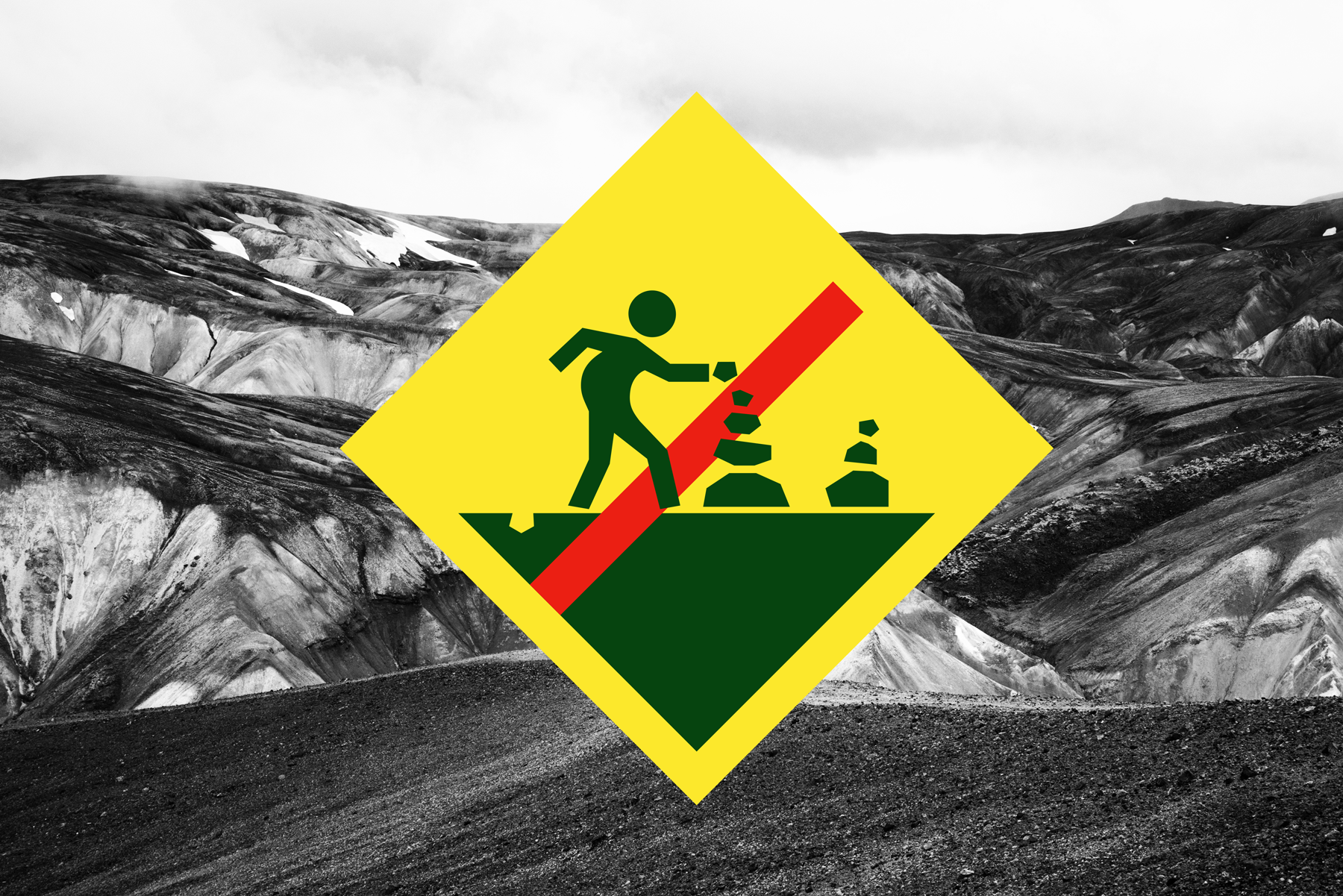
Hætta / Athugið by Ívar Björnsson is a customizable signage system that uses humour and charismatic graphic language to address the serious issue of tourist safety in Iceland. There is a current lack of consistent and effective signage across the country and tourists often may not realize the bodily risks encountered while traveling the countryside—whether intense winds, unpredictable beaches, or glaciers.
How would you describe your project?
The increase of accidents in Iceland following the tourist boom is a national concern. Current Icelandic warning and danger signs are not sufficiently effective or systematized.
My objectives were to create a signage system that succeeds in grabbing attention of passersby and to establish a synchronized look for Icelandic danger signs. With my project, I wish to make tourists more aware of their surroundings and decrease accidents in Iceland.
The project is a continuation of my final thesis, Warning: The status of warning signs in Iceland, and consists of a signage system and a website developed in collaboration with Atli Elfar Helgason. The website is intended for people who are involved with the safety of tourists, such as landowners or municipalities, so they may access danger signs relevant for their area and have them manufactured. At the final exhibition in Listasafn Reykjavíkur people could navigate the website. The full-size signs that were on display were manufactured in collaboration with Merking.
What were you thinking about at the start of it? What were your driving concerns? What were you responding to? What outcomes were you hoping for?
My family owns a summerhouse in Vík í Mýrdal close to the infamous black sand beach Reynisfjara. After the second tourist drowned there last year the landowners made a danger sign which was criticised by the Icelandic graphic designer Atli Hilmars. Atli pointed out that the colours were not working together and that the wording was too complex. Inadequately designed signs are a recurring problem and studies have shown that poorly done danger signs can even exacerbate the danger of the situation. This inspired me to do my thesis and to propose a solution.
Can you describe your research or making process? What were you reading? What was your process? What went smoothly? What went unexpectedly?
For my initial research I collected a huge number of pictures online of danger signs taken by tourists traveling around Iceland. I even watched video logs on YouTube of tourists traveling around the country in hopes of screenshotting pictures of signs. After that I spoke to several Icelandic agencies that make danger signage for more information about the current system. I learned that none of these agencies follow through with a synchronised system. In my opinion there should be a consistent system in place—seeing the same signs repeatedly across Iceland would strengthen their effects.
Danger signs are the interplay between location, size, form, colour, typeface and icons. All these components need to be considered. To support my research and the development of a signage system I used books such as Signage and Wayfinding Design by Chris Calori and David Vanden-Eynden. My system is divided into two categories. One category covers dangers and the other category covers rules and restrictions.
The majority of location signs in Iceland are in the horizontal rectangle form and to counter this I used the diamond shape. The shape itself would be an element to grab the attention of viewers. I created a headline typeface that would be as recognisable as the diamond form, an unusual typeface that people could instantly recognise as signalling danger.
Research has shown that humour in signage makes them more noticeable. This became influential in how I approached my icons. I spent a substantial amount of time designing them because they must portray information across languages and cultures.
What are your current plans? Next steps for the project? How are you feeling about entering the workforce as a young designer?
I am in talks with the Environmental Agency of Iceland to test the signs at tourist attractions. Hopefully that will lead to a continued cooperation across different groups to bring consistency to danger signage in Iceland.
As a graphic designer, I specialize in typography and web design. My next steps are to move into a studio this coming fall, continue my collaborations with Atli Elfar, and to release a typeface for DesignMarch 2018. If you need a crazy cool website, please contact me.“
Danger / Attention is a website conceived to coordinate the look of warning signs in Iceland. The system, which is designed from scratch, allows managers of tourist sites to design their own signs, thus contributing to the coordination of warning signs. The system provides users with access to templates with captivating typeface, unconventional forms, and pictograms designed to efficiently catch the tourists’ attention.
You can visit the project site at www.danger-attention.com.
Interview by Michelle Site / illustrations: Ívar Björnsson