Print is dead, long live the print! We at HA magazine love print – we publish it, read it and talk about it all the time. Each month, we will ask a like-minded fellow print enthusiast to share some favourites with us. First up, we talked to graphic designer Hörður Lárusson.
Words: Hörður Lárusson. Photos: Rafael Pinho, Viktoria Ivicsics. Other photos: Courtesy of publishers
Hörður Lárusson holds a BA in Visual Communication from the Iceland Academy of the Arts. One of the key figures in the Icelandic graphic design today, Lárusson works as an Art Director at Brandenburg.

Portrait by Rafael Pinho
His works have been exhibited widely both in Iceland and abroad, and he has served in numerous juries and boards, including the Iceland Design Centre and DesignMarch boards of directors. You can see Hörður’s work here and here, for example.
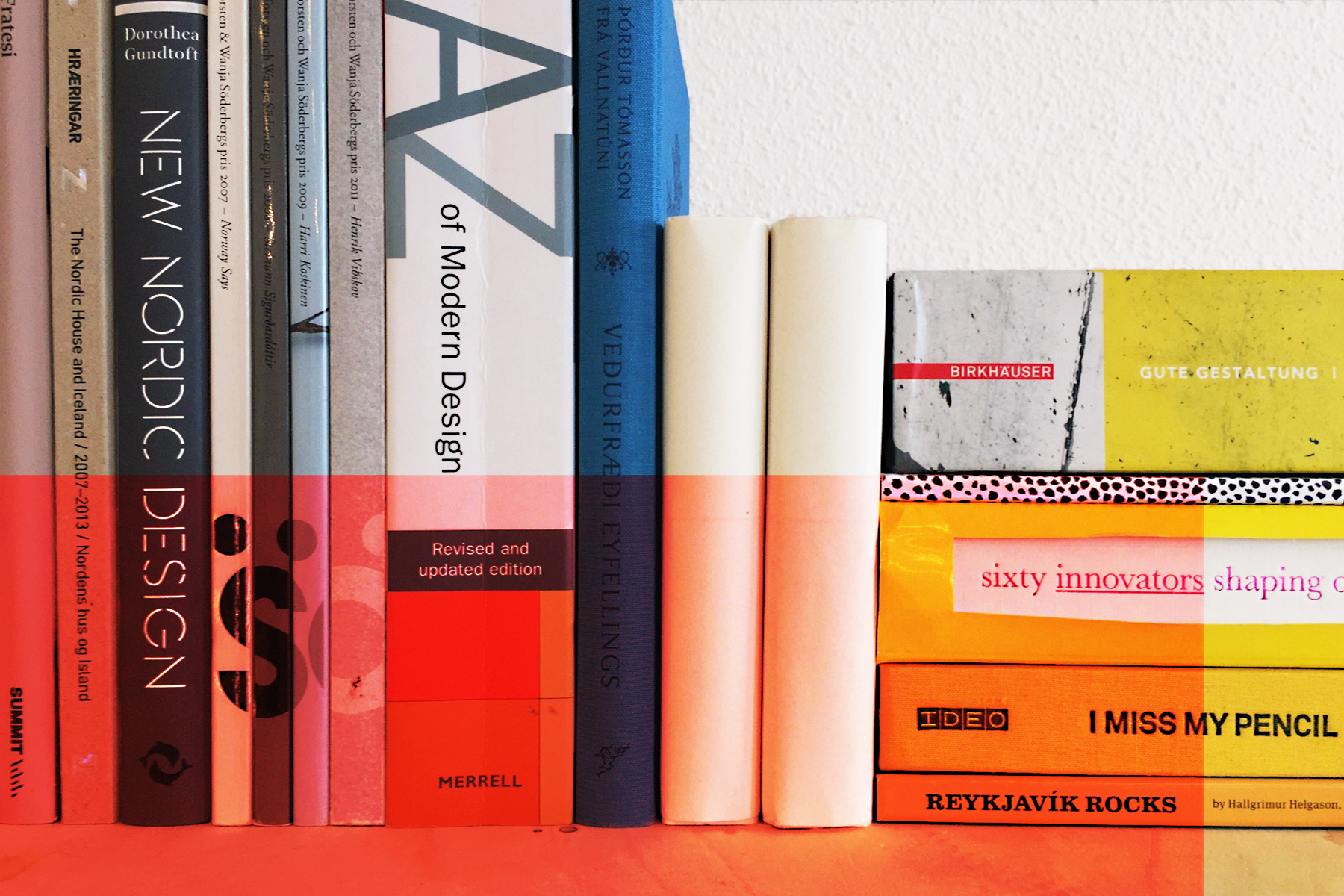
Here are the books (and posters) that inspire him: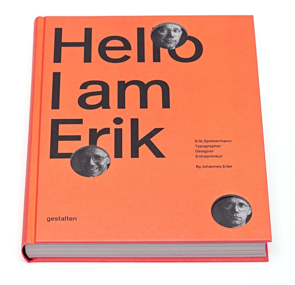
Hello I am Erik
by Erik Spiekermann
It’s the book I’m trying to read these days (but don’t find enough time to do). Not sure yet if it’ll be a book that inspires me, but it is quite a nice read. The complete story of Erik Spiekermanns career as a graphic designer to date. But even if the book won’t end up inspiring me, it’s hard to deny the influence Eriks typefaces and work has had on my work over the years. Plus, the book looks really really good on my book shelf.
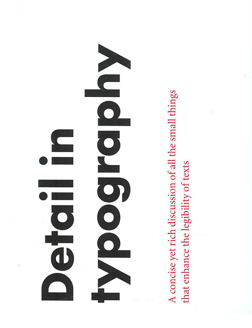
Detail in typography
by Jost Hochuli
This book is most likely my favourite book to own, use and hold. I’m currently on my third copy of the book, because I frequently lend it to people and loose it (which I kind of don’t mind, since then someone else now owns a copy of this great little book). But now I need to be more careful, because this little gem is out of print and the publisher has said it won’t be re-printing due to costs. Which is sad, because everyone should own a copy. (Although there are rumours that a french publisher is looking into re-publishing it.)
The sub-title of this book describes it as a concise yet rich discussion of all the small things that enhance the legibility of texts … but it’s the other description on the cover that really gets me; “Letters, letterspacing, words, wordspacing, lines, linespacing, columns”. Who wouldn’t fall in love with this book? Plus, it’s really cute and nice looking on my book shelf.
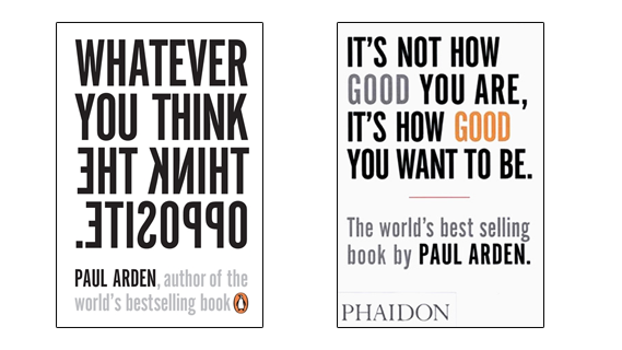
Whatever you think, think the opposite and
It’s not how good you are, it’s how good you want to be
by Paul Arden
These are two small books, published by Phaidon and Penguin, and they sound like self-help books. Which they kind of are … for designers and creative minds. They were recommended to us when I was in school, and I followed the advise and bought them. And read them. And I haven’t read them since. And I might not ever read them again. But they get to stay on my bookshelf (even after I brutally removed about 90% of my books from my living room book shelfs). The reason really has nothing to do with their contents.
Their contents are pretty much what you’d expect from the titles … and I believe they are a great read for all. It’s a collection of all the good advice you need to hear at some point. But to me they symbolise what I learned in and around school, over 10 years ago. Those really important lessons my fellow-students and friends (and sometimes teachers) taught me. Plus, they look kinda good on my book shelf.
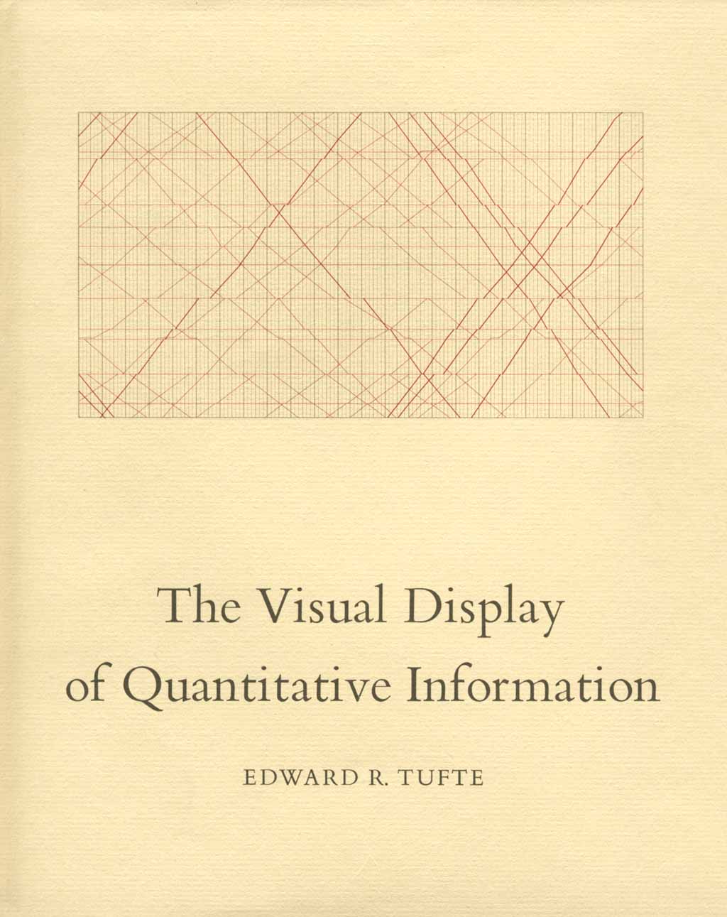
The Visual Display of Quantitative Information
by Edward R. Tufte
This is not a book for everyone … but those who can appreciate it, love it. At the point when I fell in love with information design, this book was the first book on information design I knew I had to buy. The name sounds very scientific-y and it looks the part too. Reading through it doesn’t change that impression at all. But the information in it, the history of information in it and the information of information in it is wonderful.
The Visual Display is not Tuftes only book and actually not my favourite of his. The 32 page book; The Cognitive Style of PowerPoint: Pitching Out Corrupts Within, is the one really everyone needs to read. It tells you all about how what the problem is with PowerPoint and it’s ready-made designs. How they (in Tuftes own words) usually weaken verbal and spatial reasoning, and almost always corrupt statstical analysis. I know, sounds sexy.
But it’s the Visual Display that is and will be my inspirational information book of my book shelf. It just might be the best book you will ever see. Plus, it looks so classically beautiful on my book shelf.
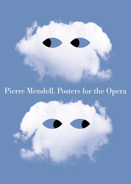
Pierre Mendell. Posters for the Opera
by Pierre Mendell
This is not so much about the book, but the content that I love. Pierre Mendell is the closest thing I have to a favourite designer. His work that has really touched me are the posters he did over his life. Simple, striking posters … with such a clear visual message that really strikes home every time.
One of his most famous posters were the poster series he did for the Bayerische Staatsoper (the Bayern Operahouse) in Munich, from 1993 to 2006. Every poster has the same typographic frame, but changes the visual language to suit each opera performed over the 13 years. Mendell’s simple, visual language is something everyone and anyone can enjoy and be inspired by. Plus, this book really looks nice on my book shelf.