Every year the DesignMarch festival in Reykjavík is ignited with big-name lectures at DesignTalks. There the world’s leading designers and design-thinkers share their wisdom and show us the innovative power of design.
Jonathan Barnbrook, one of Britain’s most prominent graphic designers, is among those who will take the stage on DesignTalks this year. Barnbrook is a typeface designer and design activist best know for his collaboration with Adbusters and artist like David Bowie and Damien Hirst.
We at HA-magazine wanted to warm him up a little before his visit to Iceland and asked him two questions:
If one looks closely at David Bowie’s career it becomes obvious that he sought some inspiration in modern occultism and symbolism. This can both be heard in his lyrics and seen on his album covers. Can you tell us if there is any connection to this esoteric symbolism on the last four album covers you designed for Bowie?
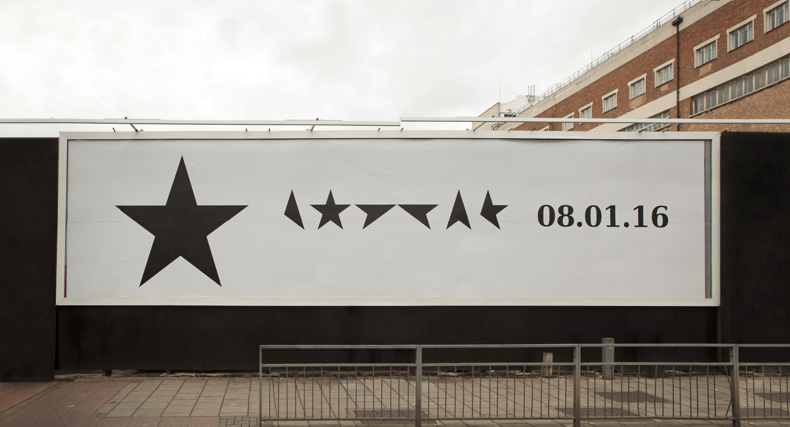
Actually we talked more of emotionally how the music felt or the big universal themes. The covers I did are not just about the music, even if that was the primary purpose. He really left it up to me to interpret time and circumstances that it was released in. The last album ★ was specifically about spiritual rather than occult themes but of course, that is all part of the questions one asks when facing our death.
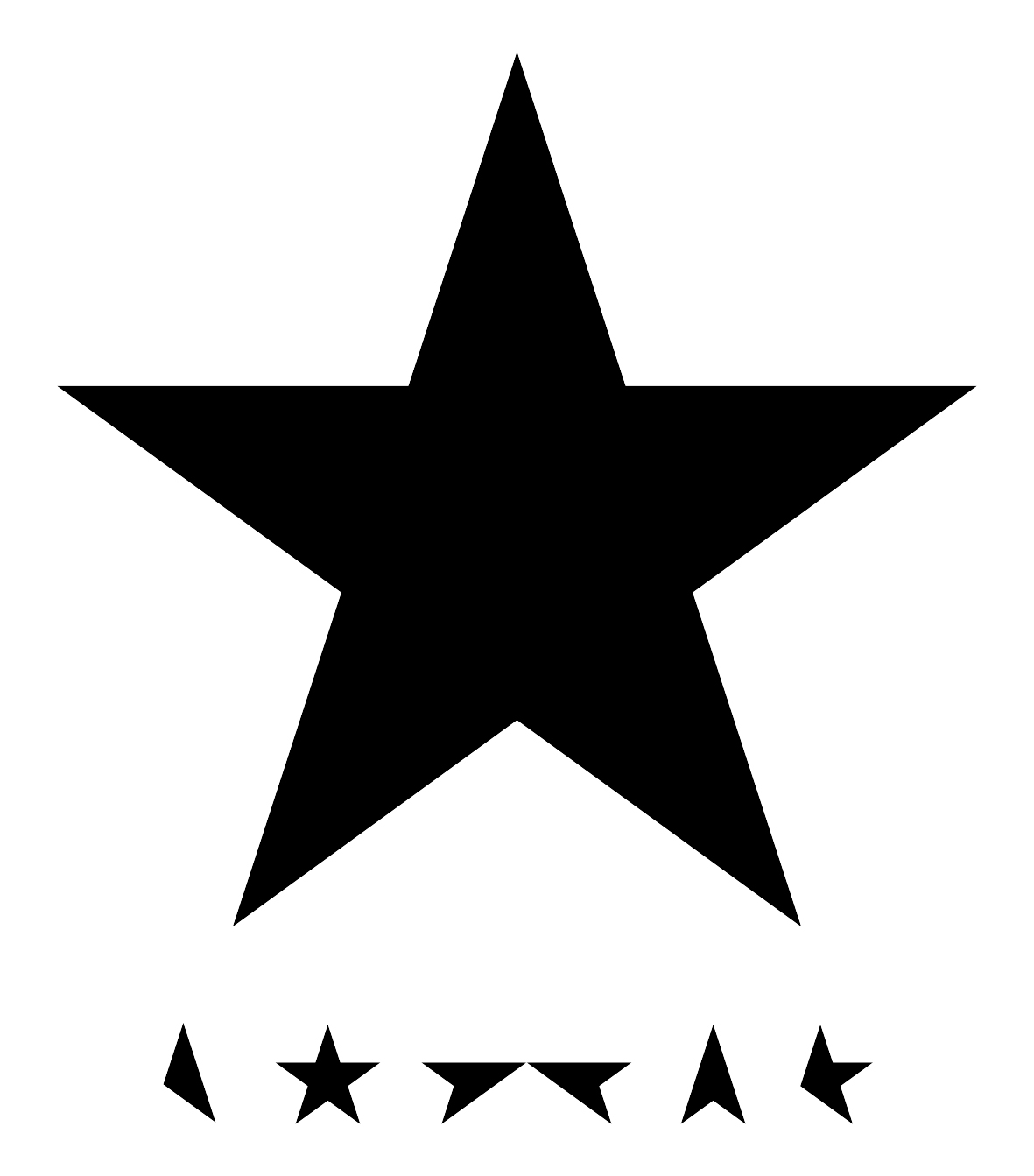
Barnbrooks cover design of Black Star, Bowie’s last album.
Personally I have always been interested in the way this symbolism infiltrates everyday life, letterforms – this was part of the theme of the font mason. One thing more obvious in the work I have done for Bowie is the power of basic, simple forms. They do have a magical power. So this is the reason for the square and then the star. If they are thought about properly, they are great aids to contemplation. With the square especially it is worth looking at the work of Malevich. Initially it looks quite non-objective but he was a big believer in the mystical power of these forms.
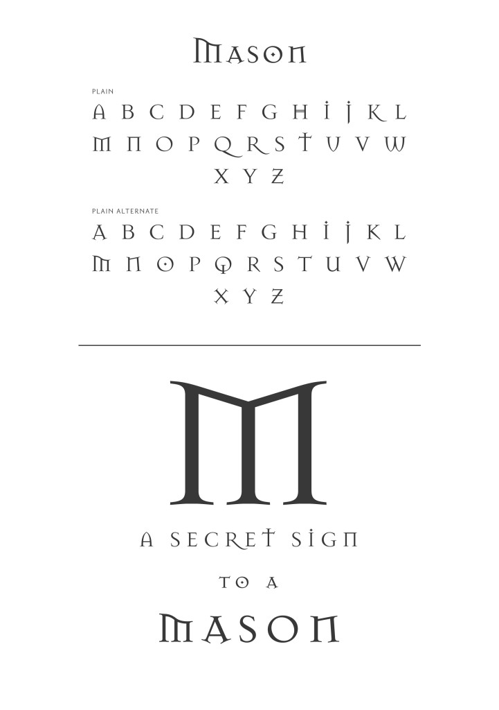
The font Mason from Virus – Barnbrook’s font foundry.
You have encouraged other graphic designers to use their skills for design activism and adbusting rather than working for lying corporations. If you could erase one sellout moment of your early career, what would it be? And what is your favourite adbust of all time?
That is a good question, actually there were 2 things. One was an advert for a nuclear power station. At the time I believed absolutely in science, but now looking back on it with the activist work I have done, it probably wasn’t a good thing to do. The other was the typography on an advert for Nike. Fortunately I had the pleasure of being in a lecture to students in Sydney where I heard the head of Nike of the region was in the audience. A lot of the other speakers were not discussing any of the issues around the obviously corporate clients that they were working for. I showed the Nike ad, and stopped it halfway through and went through all of the issues of sweatshops. He got up and walked out. Did it change anything, probably not. I think it was more of a demonstration to the students there that these issues were important and they should have a bit of courage in their convictions.
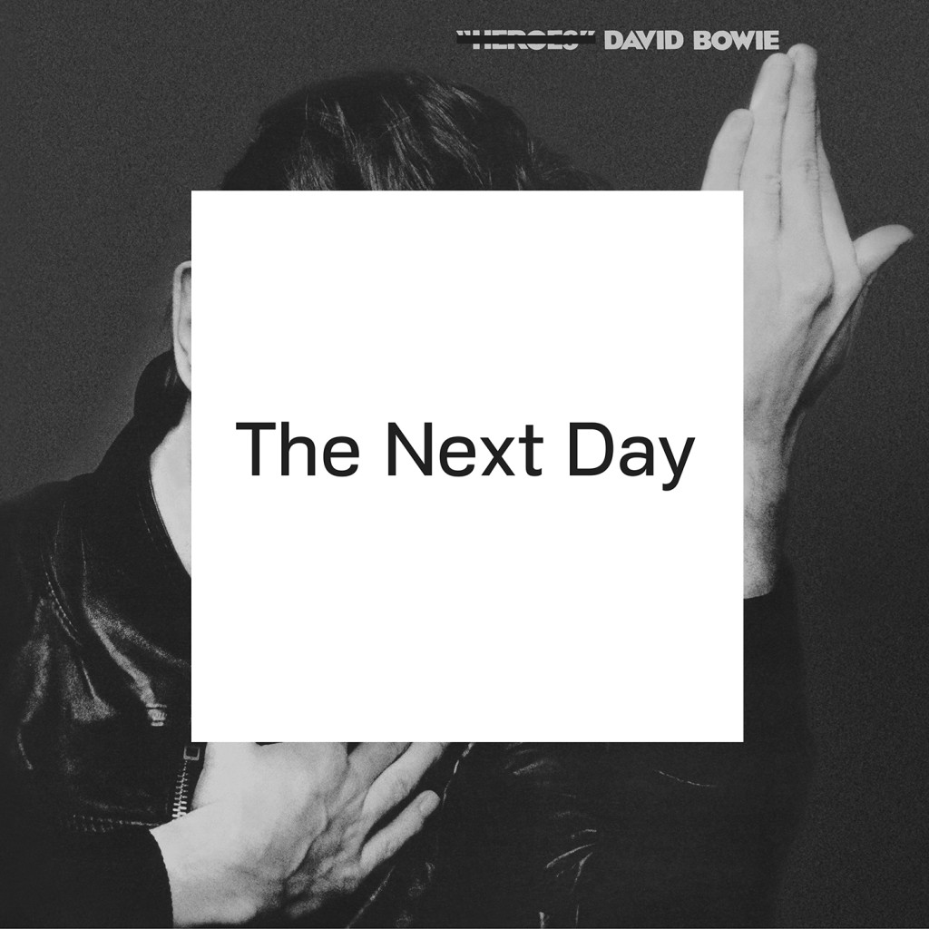
Jonathan and David Bowie wanted to do something different for the album The Next Day. Here the word “different” is an understatement because the outcome was one of the most debated album cover of all time. They reused Bowie´s iconic Heroes cover and obscured it with a white square. Read more on Jonathan´s journey to the white square on his blog at Virusfonts.com